![]()
Notice something new about BeyondCurious?
We have unveiled a new logotype that captures the essence of who BeyondCurious is and how we operate as an innovation consultancy: bold, inventive, pragmatic, impactful, and relentless.
- Inside the square logo mark, the negative space visually conveys the letter “B” while the open circle forms the letter “c” representing our company initials
- The “c” being made up of an open circle reflects our open-ended approach and the iterative process we use to develop solutions for our clients
- The light weight of the elements captures our energy and agility while the square that surrounds the elements conveys stability reflecting our reliability and accountability
During the design process we looked at a wide range of different brands for inspiration. Here are five companies that do a great job visually expressing their brand through their logos:
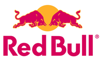
Red Bull
Red Bull's use of bright red and yellow visually reflects an excited or "alert feeling," which definitely accurately conveys the promise of this energy drink. The association with dueling bulls also creates a sense of tension and strength, increasing the appeal to its adrenaline-oriented audience.
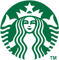
Starbucks
Starbucks continues to reinvent itself in terms of brand and products. Throughout the years the brand has evolved from its humble beginnings to emerge as a much more polished version of the purveyor of coffee beverages with inordinately long and convoluted names. But, wisely, Starbucks never strays too far from the seductive siren that has formed the cornerstone of its brand from the outset.

COLORS Magazine
COLORS was originally conceived to spread the message that "diversity is good." We can clearly see in the COLORS logo a face and eyes that infer the reaction of a reader to magazine content. Magazine co-founder Oliviero Toscani believes that magazines should use only unforgettable images. In the "O"s we can see that the reader's eyes are wide open, conveying any number of emotions, and portraying a reader who is clearly riveted.
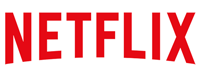
Netflix
Netflix, like Starbucks, continues to reinvents itself, and the brand recently updated its logo to reflect its changes. In 2014, with minimal fanfare, Netflix quietly rolled out a new version of its logo, ditching the dated 3D type treatment it had previously used. But you could be forgiven if you didn't notice this quiet yet intentional move away from the nostalgia of an old cinema marquee. What emerged was a new, much more clean and modern mark that reflects the fresh original content Netflix is now producing.
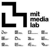
MIT Media Lab
MIT Media Lab's new identity, designed by Pentagram, consists of a visual glyph system that gives a separate identity to each of its 23 separate research labs but still forms a cohesive system that unifies all the labs under the umbrella identity of the Media Lab. Now, that approach is just plain smart.
What's in a logo? A well-designed logo expresses a company's essence — its personality and brand promise. But, a logo also needs to capture your attention and position a brand favorably in your mind.